ExaDo — SaaS web app for health practitioners and their patients
ExaDo is a Vienna-based healthcare practice management platform that bridges the gap between patients and doctors through a single digital ecosystem. It gives non-equity doctors full control over how patient data is used, while patients decide who can access their records.
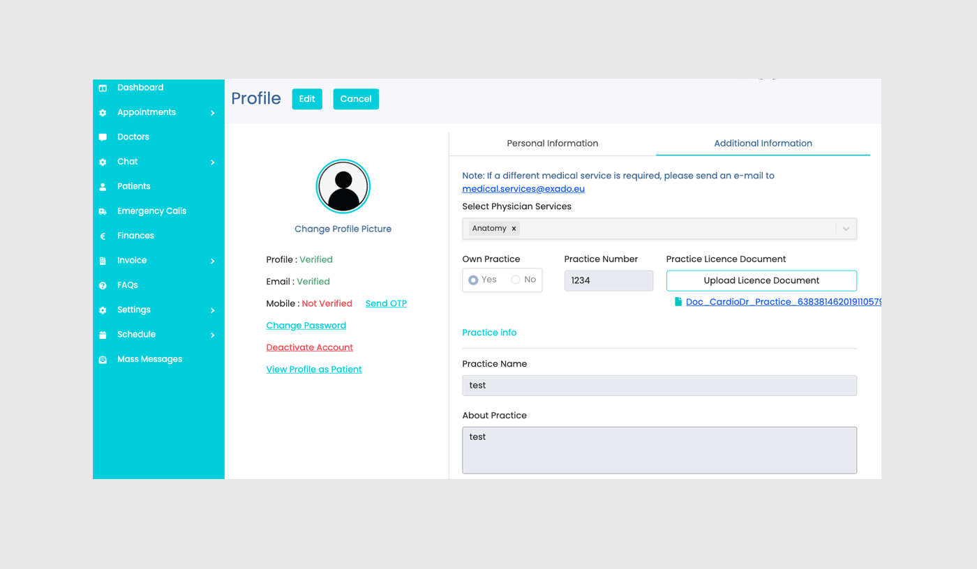
As the UX/UI Lead on this project, I worked with the ExaDo team to shape both the digital product and its identity. My most important task was creating a scalable design system that supports future business expansion.
The product identity reflects a clean, minimalist design language built around functionality, ensuring that both patients and doctors can navigate complex healthcare workflows with clarity and confidence.
Project include:
Create scalable design system
Visual identity
Redesign UI interfaces
Landing Page Design
Design System
Overview
When I joined ExaDo, there was no established design system, only a working prototype, no Figma setup, and no shared reference for the development team or designers.
I built the design system library in parallel with the web app redesign, that mean defining tokens and components as I designed screens. The system covers grid and spacing rules, a full typography scale, a colour system with accessibility checks, an icon set, and a component library with defined states and variables.
What follows is how each layer of that system was built: the type scale, the colour logic, and the component architecture.
The starting point
The first step was analysing the existing prototype and identifying visual issues, research competitors then building a mood board for the new direction. The prototype itself worked as wireframe. The user flows were already established and I needed to redesign without breaking it.
Typography hierarchy and colour were the first things to resolve
Typography
The ExaDo project has two fonts. The main body font is Roboto, chosen for its legibility and functionality in UI interfaces. Ubuntu is only used for headings, creating a more distinctive text hierarchy.
Above you see the established typography style system for the web app and landing page, and where it's been used. The styles are labelled using the same language as they would be in code. I think it makes things easier. The image below shows how the typography styles look on the web app dashboard.

Colour
The original brand colour failed WCAG AA contrast requirements. It was too bright and intense to be used as a background colour or as navigation in UI elements. I replaced it with a darker greenish teal that passes contrast checks, and paired it with a soft white (#FCFCFC) for both the landing page and web app backgrounds. The softer white reduces the overall intensity on screen and eases the strain on the eyes, a small detail, a big impact.
The palette is split between brand and functional colours. The brand palette contains three shades. A dark teal anchors the identity, chosen because its green undertone signals care and wellbeing, while its light teal component communicates precision and reliability.
The secondary palette plays a more functional role. Each hue maps to a specific interaction type: blue for upcoming appointments, gold for pending, lavender for chats, rose for emergencies, mint for verifications. The secondary palette appears only on card icons, never as a background or decorative fill.
Brand colour, CTA buttons, active navigation, verification icons.
Interactive feedback — selected cards, tag fills, hover states.
The secondary palette exists for one reason: orientation. Each colour maps to an interaction type — blue for upcoming, gold for pending, lavender for chats, rose for emergencies, mint for verifications — and appears only on card icons and tab highlights. Light shades mark personal items, darker shades mark clinic items. It's a small, deliberate detail, but in a dense healthcare app its makes a difference.


Headings H1, H2, H4, H5.
Heading H3, body text.
Inactive text in buttons or fields.
Accent text to draw attention.
Web app background.
Landing page, cards.
Cell title backgrounds.
Input field borders.
Dividers.
| Background | Text colour | Contrast | WCAG AA |
|---|---|---|---|
| Teal 100 | Negative | 2.4 : 1 | Fail |
| Teal 100 | Teal 800 | 6.58 : 1 | Fail |
| Teal 100 | Grey 700 | 7.6 : 1 | Pass |
| Teal 100 | Grey 700 | 16.26 : 1 | Pass |
| Grey 100 | Negative | 2.4 : 1 | Pass |
| Grey 100 | Teal 800 | 6.58 : 1 | Pass |
| Grey 100 | Grey 700 | 7.6 : 1 | Pass |
| Grey 100 | Grey 700 | 16.26 : 1 | Pass |
| Teal 800 | Negative | 1.03 : 1 | Fail |
| Teal 800 | Grey 700 | 1.15 : 1 | Fail |
| Teal 800 | Grey 50 | 7.18 : 1 | Pass |
Atoms. Molecules. Organisms. Templates. Pages.
The priority was creating a system that stayed cohesive throughout the entire product. Everything in ExaDo was built following atomic design. I started from buttons and composed upward. This allowed the developer team to implement finished components while I was still working on the layouts and visual design. That way, they didn't have to wait for me.
Each component was designed with its own set of states. From inputs with validation and error messages to upload indicators that show every step from default through to failure. All components follow the same visual logic to give clear feedback at every interaction point.

The table card is one of the most complicated components in the UI. It appears on almost every page of the product for different purposes, therefore it was designed so that every cell has variables, which means I don't need to redesign the table on new pages, I just need to update and change the variables.


The spacing system uses a 4px base unit applied consistently across every screen. This removes guesswork from layout decisions — both in design and in development — and ensures visual rhythm holds as new features are added.

Web App
Overview
What makes ExaDo distinct is that the product was developed in direct collaboration with the doctors who test it and will use the end product. Every feature and workflow is grounded in what private clinic practitioners actually need in their management tool to run a clinic.
Starting Point
The original prototype prioritised functional coverage over visual refinement. Inconsistent spacing, typography, and component styles made the interface feel like a working sketch rather than a product healthcare professionals would trust. During my analysis, I also looked for areas that needed improvements not only visually but in how information was organised, without breaking apart the created flow.
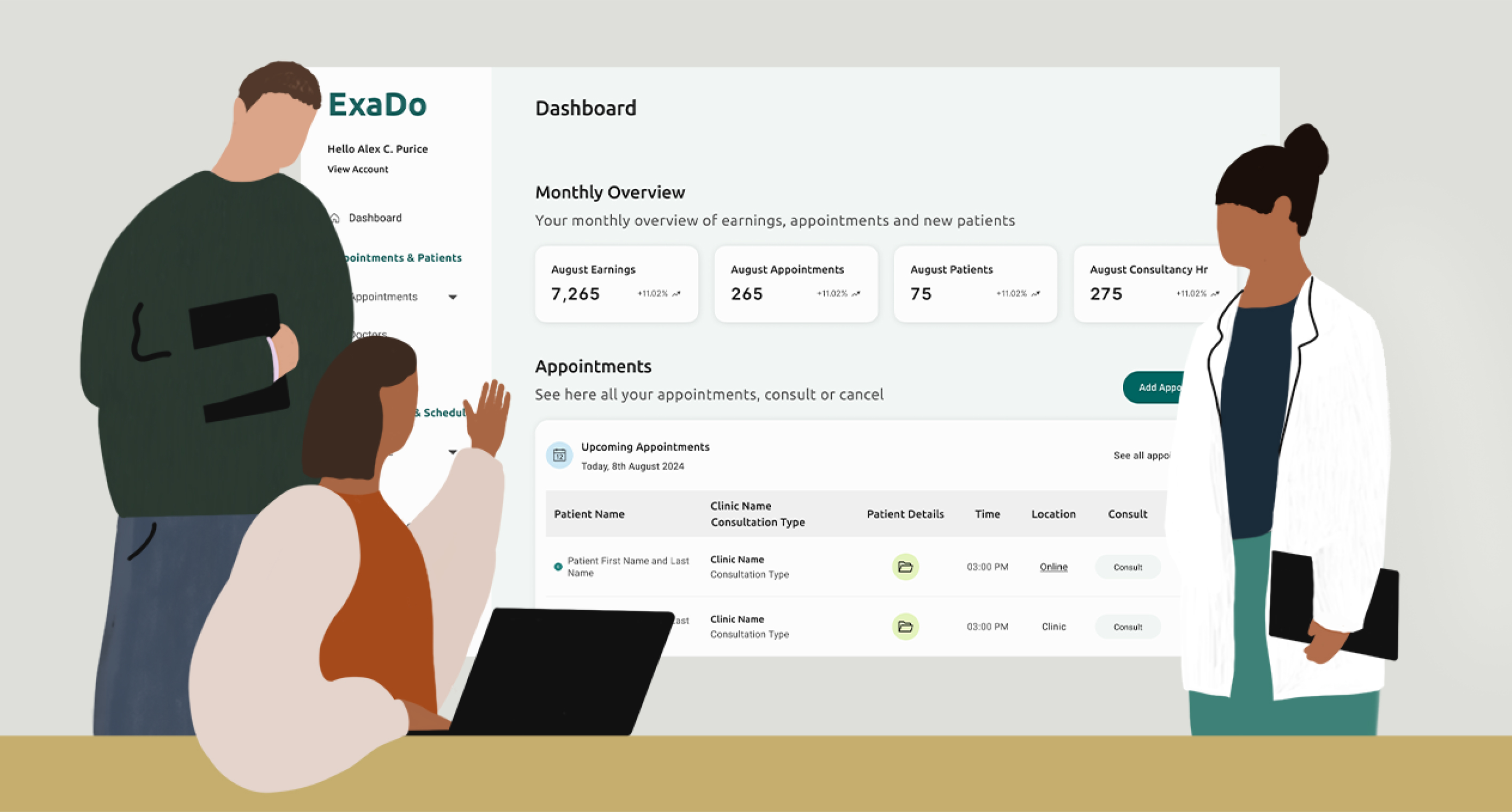
The redesigned dashboard introduces a clear visual hierarchy, a consistent component library, and accessible color and typography choices — keeping the same information architecture but making it scannable, trustworthy, and compliant with WCAG 2.1 AA.
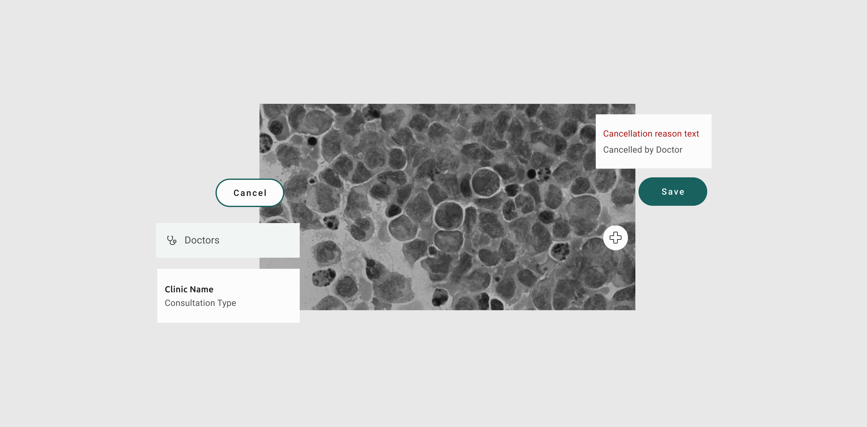
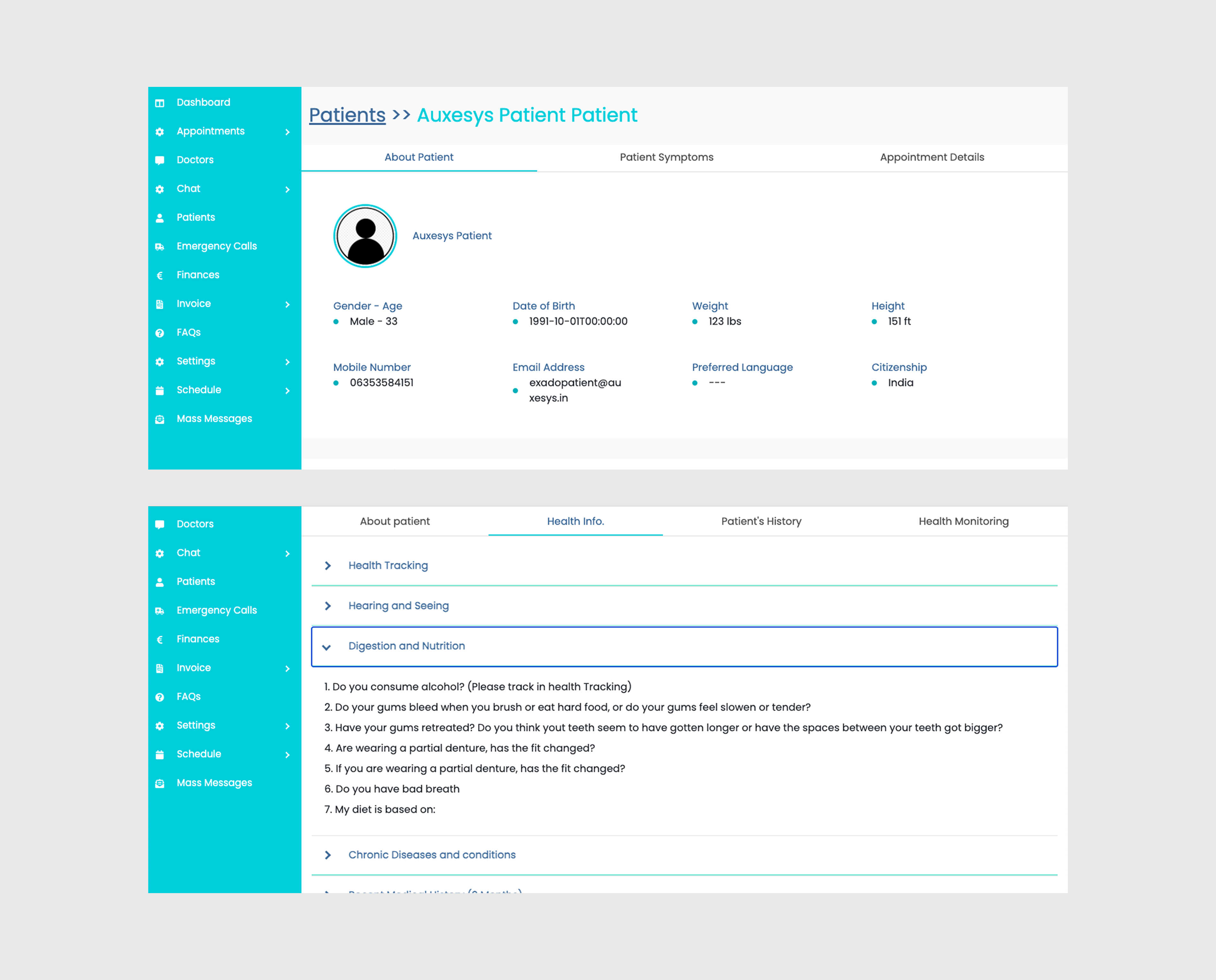
Even though the user flows had already been created, I still found some areas worth refining. On the Patient page, for example, users had to switch between several segments without keeping an overview of the patient's key information. I made a small change: patient information is now pinned to the top and stays visible, while health information, health monitoring, and appointment history sit below as segmented tabs. This approach has become a pattern across the product where the most important information is now pinned to the top in the same way.

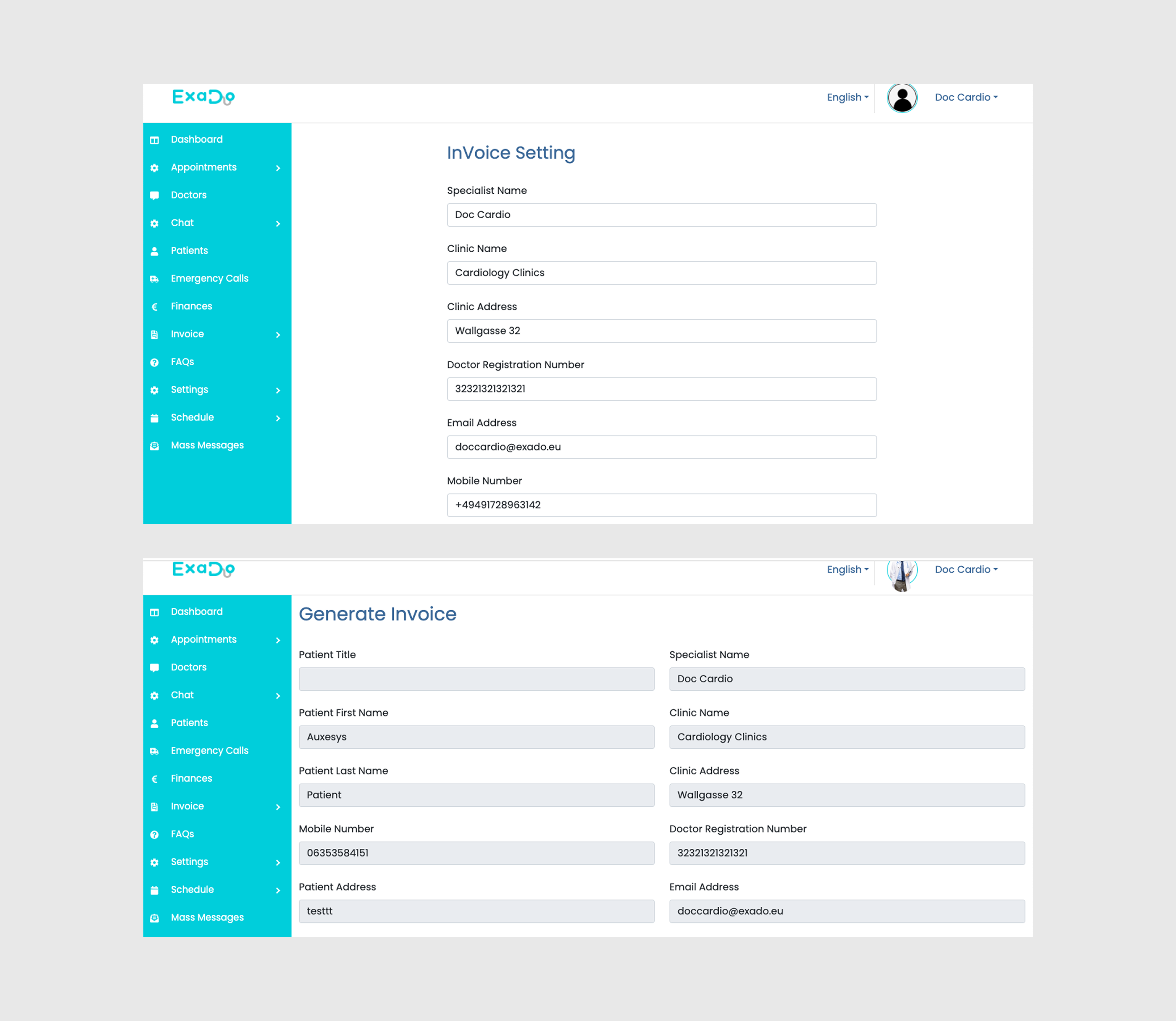
The Invoice flow already existed, but the visual design made it harder to use than it needed to be. I restructured the layout into two columns and introduced clear section headers, so the user can immediately understand which block of fields belongs to whom.
I also added contextual metadata at the top of the page (invoice number, booking ID, and date) so the doctor always knows which invoice they are working on. Finally, I gave the action buttons a clearer hierarchy: the primary "Generate" action is filled, while secondary actions like "Add discount" and "View invoice" are outlined, so the main path forward is visually obvious.


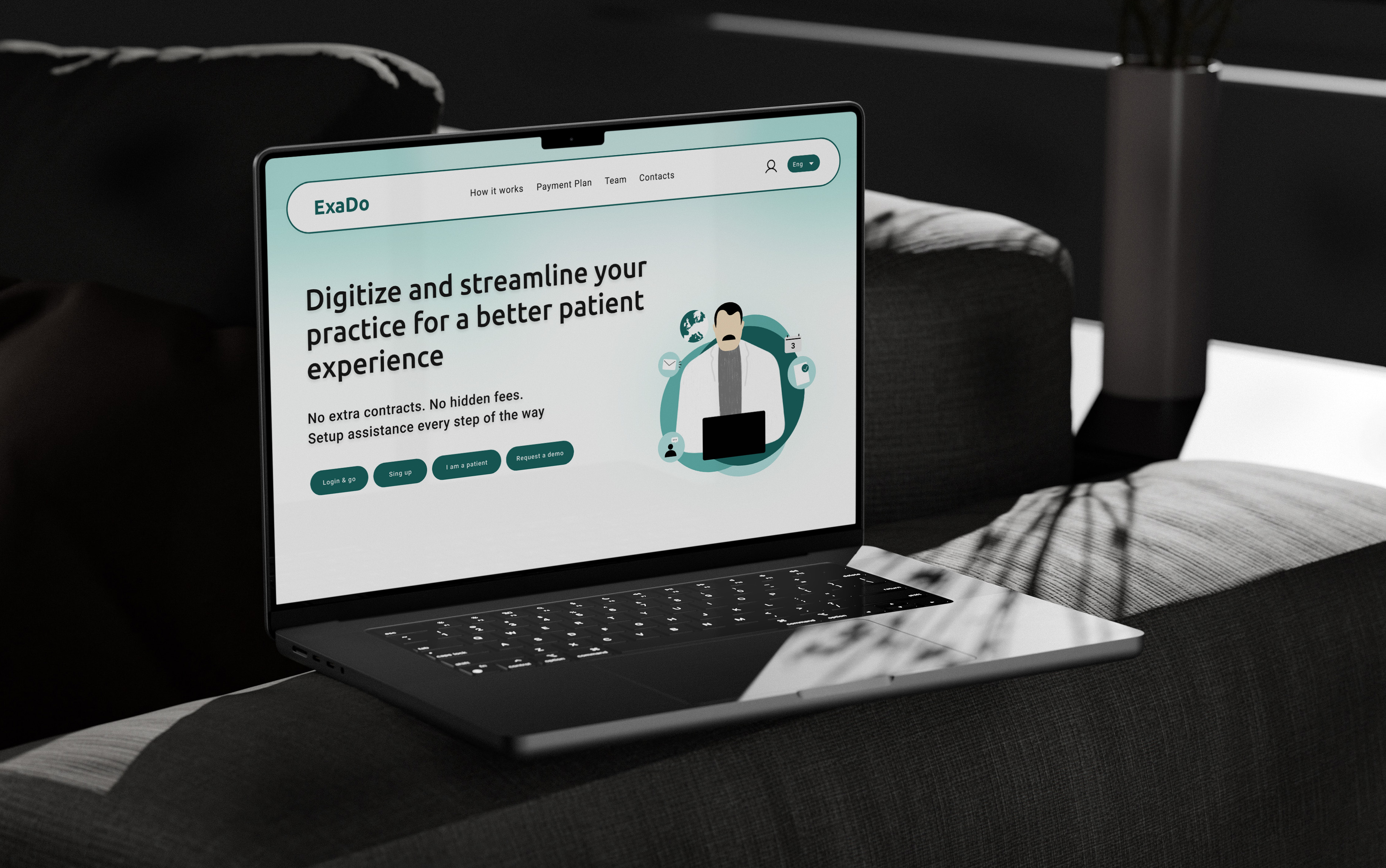
Landing Page
Overview
The landing page was the first part of the project to be designed, before work on the web app began. This meant I had to start by understanding ExaDo's full product positioning and translating it into a clear, simple page that communicated the product's value to first-time visitors.
Functionality
The landing page is designed to keep users engaged without relying on too many interactive elements. It is well documented that overly animated websites with excessive interactions can overwhelm users and make it harder to find the information they need, therefore often causing them to leave the page. With that in mind, I kept the interactions on the landing page purposeful and restrained. Contact forms, login, and account creation all open as pop-ups rather than separate pages, so visitors don't lose their context or have to navigate away from the content they were reading. The top navigation bar stays fixed as the user scrolls, making it easy to jump between sections at any point on the page.
Illustrations
The landing page illustrations were created in Adobe Illustrator as bespoke vector assets. Rather than relying on stock imagery, custom illustration was a deliberate choice, it allows the visual language to align precisely with the product's identity.