Latvijas Putnkopjiem — Website design for Latvia's poultry keepers community
Latvijas Putnkopjiem is a community platform for poultry keepers in Latvia: hobbyists, small-scale farmers, and industry professionals. The client came to me with a logo, scattered content, and a general idea of what they wanted, but no clear structure for how it should all come together online. Through a series of conversations, I shaped the project scope and direction: a website that feels warm and approachable, works for users across a wide range of ages and technical comfort, and, most importantly, makes a large volume of content easy to navigate.
This project was part of a design internship where I had the opportunity to work on a real client brief. I communicated directly with the client, owned the design direction, and was guided by senior designers throughout the process. I was responsible for the full scope, from information architecture and wireframing through to the design system and final UI. The core challenge was organising a broad range of content types (breed profiles, news, events, resources, community information) into a structure that doesn't overwhelm. Every decision in the design system traces back to that goal.
Project includes:
Design system
Visual identity
Website UI design
Design System
Overview
The design system was built to support a content-heavy website without letting it feel cluttered. With breed profiles, editorial articles, event listings, and community pages all living under one roof, I needed a type scale, colour palette, and component set that could hold everything together consistently, while staying accessible to an audience that ranges from digitally confident younger users to older visitors less comfortable with technology.
A modular approach to components means new page types can be added without breaking the established visual rhythm. The system prioritises clarity and legibility at every level, so the content, not the interface, stays in focus.
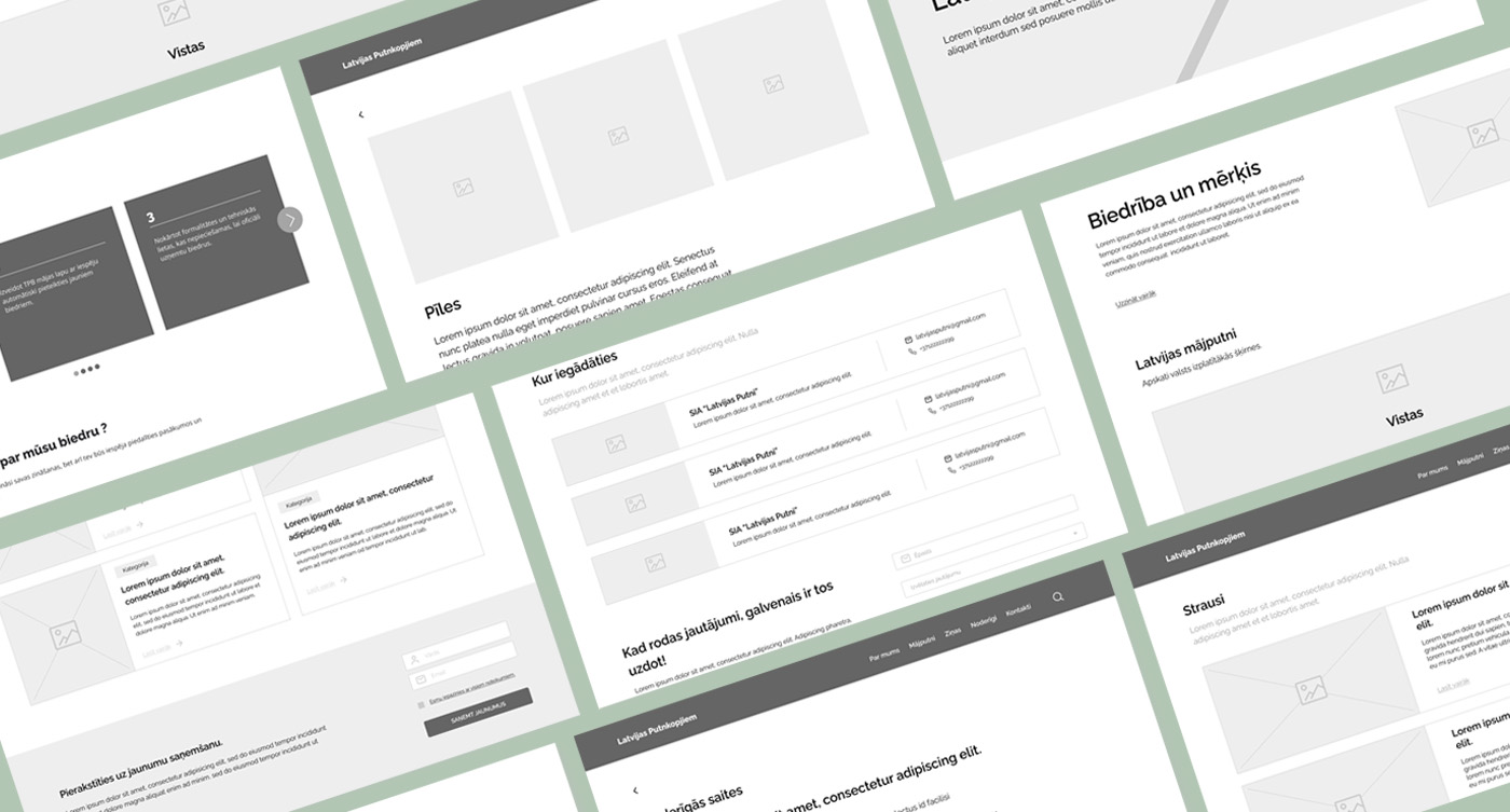
Wireframes
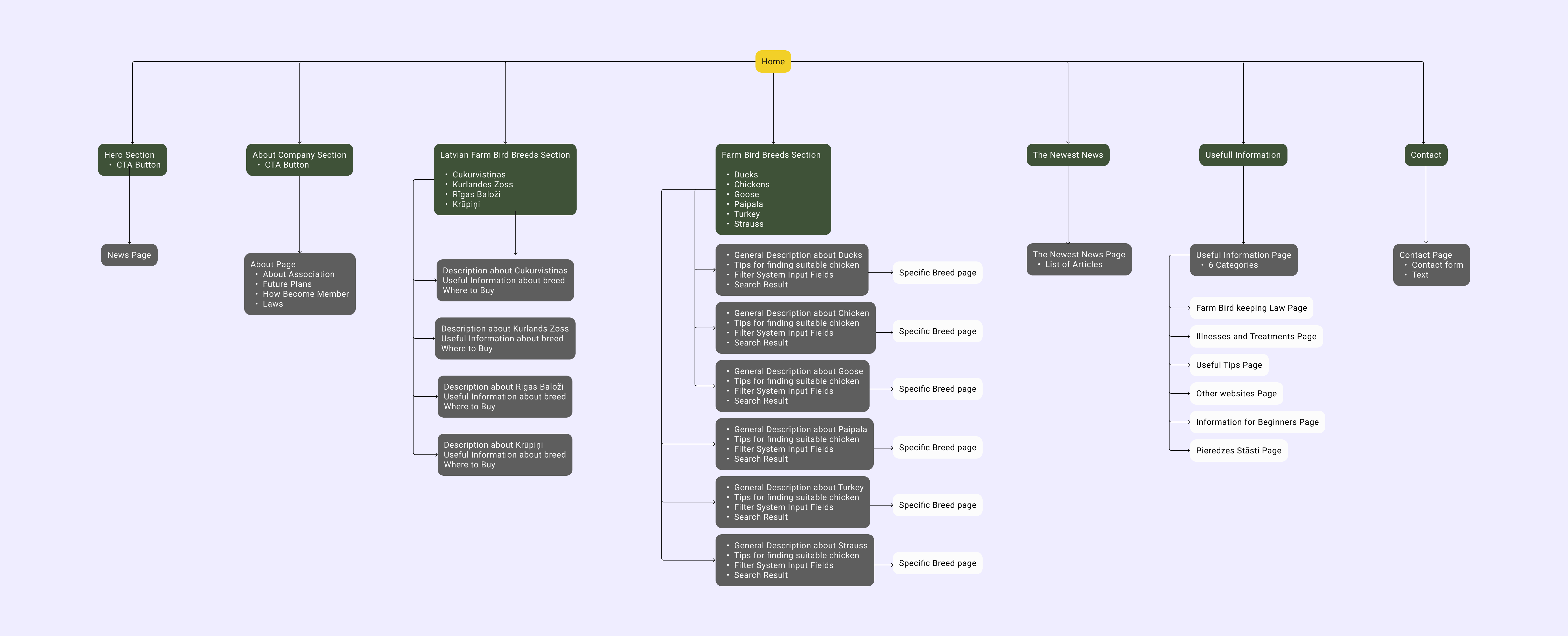
Before making any visual decisions, I focused on the information architecture. The client had a lot of content to surface: breed directories, news, resources, and event listings. The risk was burying important things or creating navigation that only makes sense to someone already familiar with the community. I wireframed the key flows and page structures to establish a clear hierarchy, test how users would move between content types, and make sure the most-visited sections were never more than a click or two away.
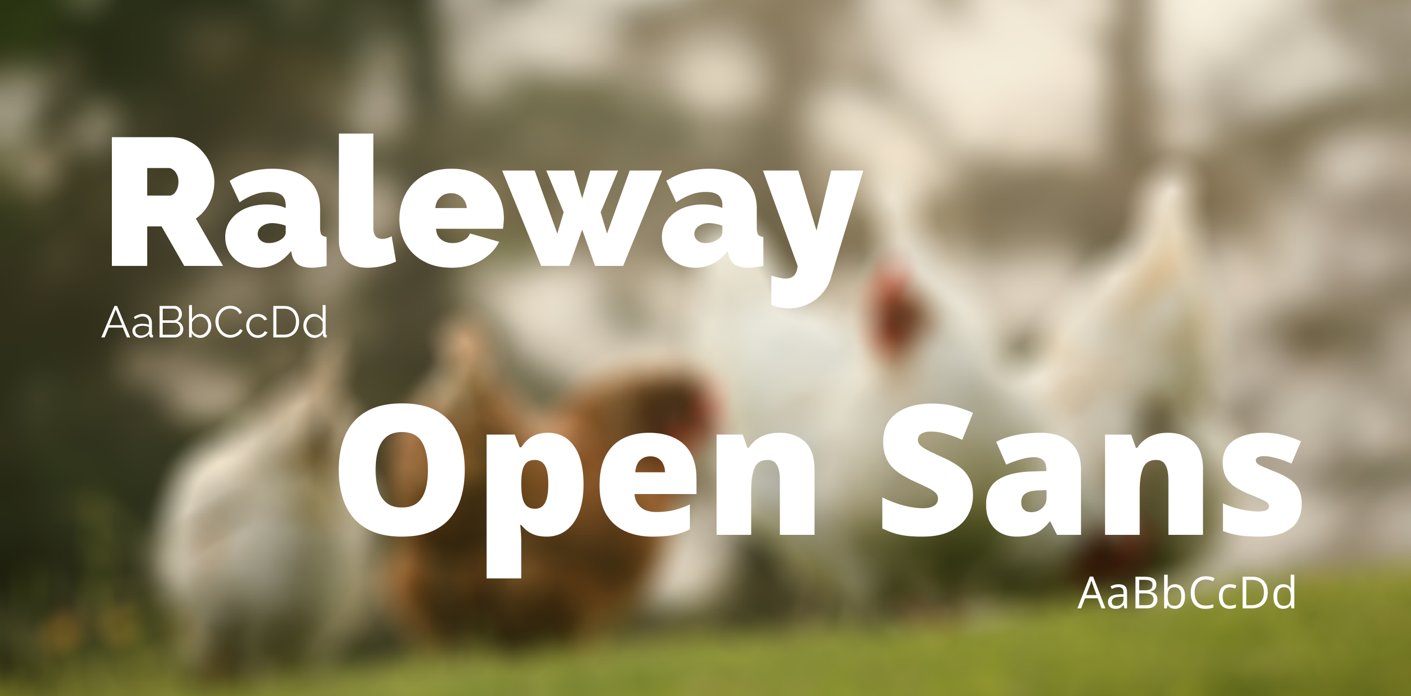
Typography
Two typefaces define the visual voice. Raleway handles headings. Its geometric structure gives the brand a confident, contemporary feel without being cold. Open Sans covers all body text, chosen for its legibility across long-form content and smaller UI elements, which matters for an audience with varying levels of screen comfort.
Colour
The palette draws from the Latvian countryside. Forest green anchors the brand with a sense of place and trust; sage green adds a lighter, warmer accent. The neutral greys keep text and UI elements readable without competing with the content or imagery.
Primary brand colour. Used for navigation, buttons, active states, and key UI elements.
Secondary accent. Used for hover states, tag fills, highlighted cards, and decorative elements.
Primary body text colour across all pages.
Secondary text, captions, and supporting UI elements.
Components
The component library defines the interactive building blocks of the site. Every component is built on the type scale and colour system, with documented default and hover states to keep the development handoff clean.
Navigation
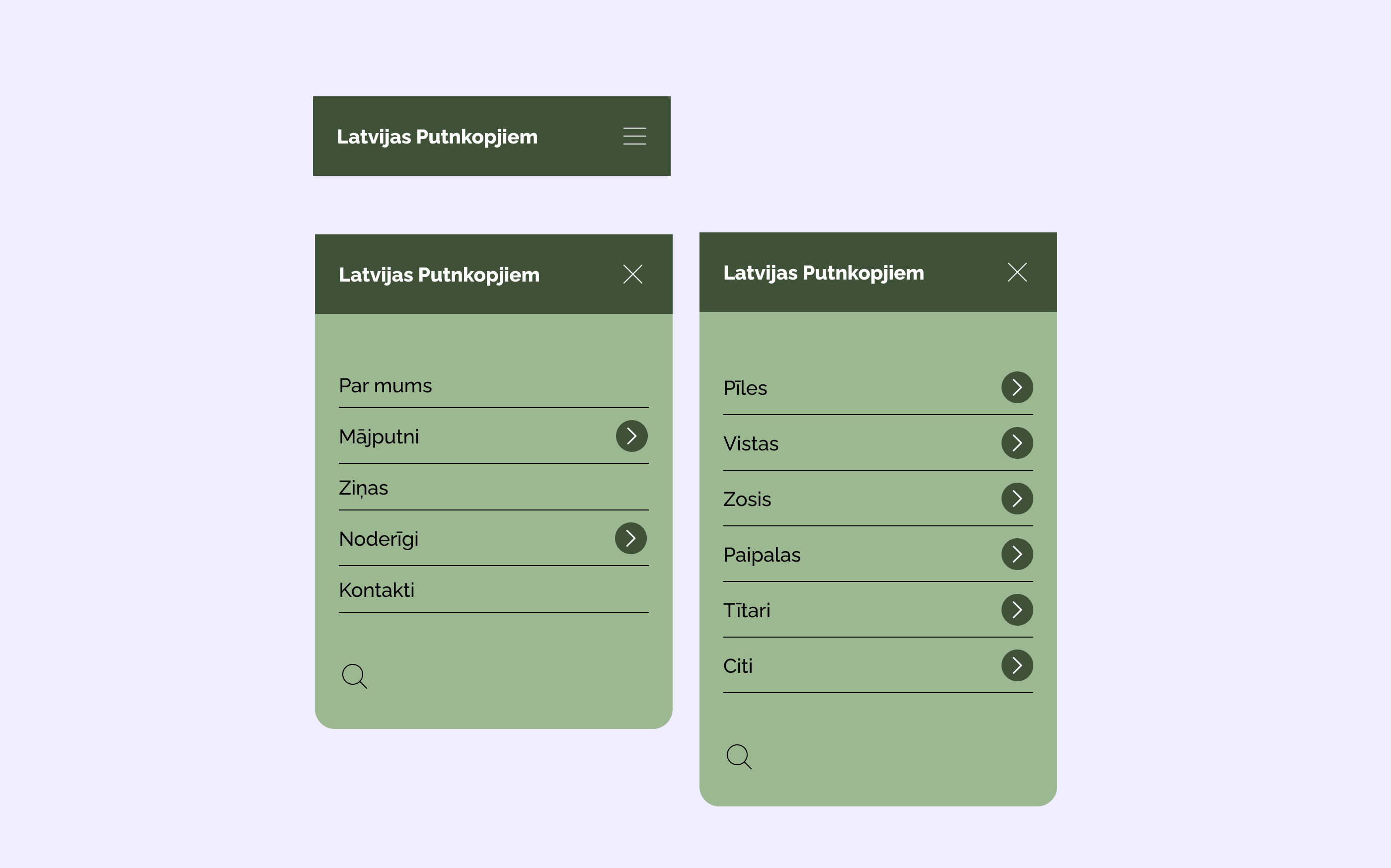
The header navigation stays persistent across all pages. Hovering a menu item reveals an underline; clicking Māputni opens a sage-green submenu that slides down and closes with the X button.
On mobile, the navigation becomes a full-screen drawer triggered by a hamburger icon. Menu items stack vertically with clear hierarchy. Categories with sub-items show a chevron, and tapping Māputni slides the drawer to a second panel listing poultry types. This two-level pattern keeps the full navigation accessible without nesting or collapsing content in place, which was important for less tech-savvy users who can lose their place in deeply nested menus.
Buttons
The website uses several button types, each with defined states for default and hover. Since the site has no forms or actions requiring validation, I didn't design disabled states. The buttons serve a straightforward navigational role, taking users from one page to another. Keeping the button system minimal reflects the simplicity of the site's interactions: no state needs to exist that isn't actually used.


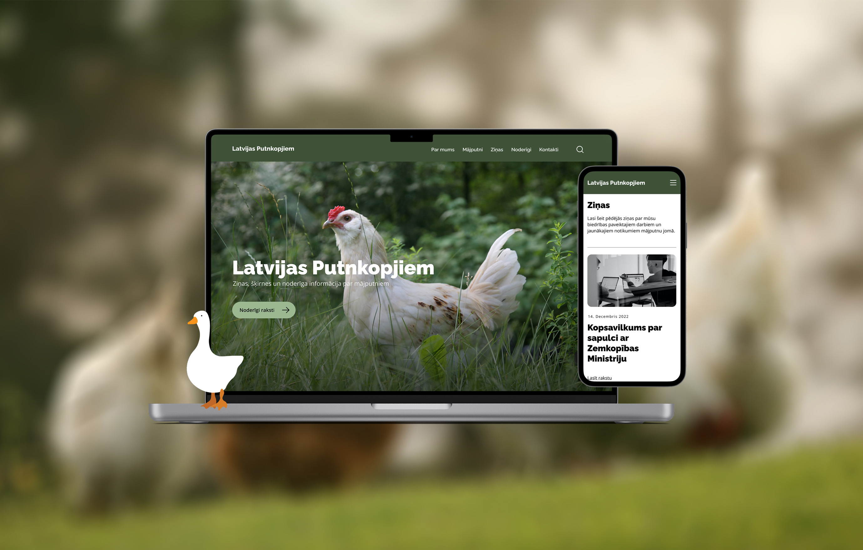
Website
Overview
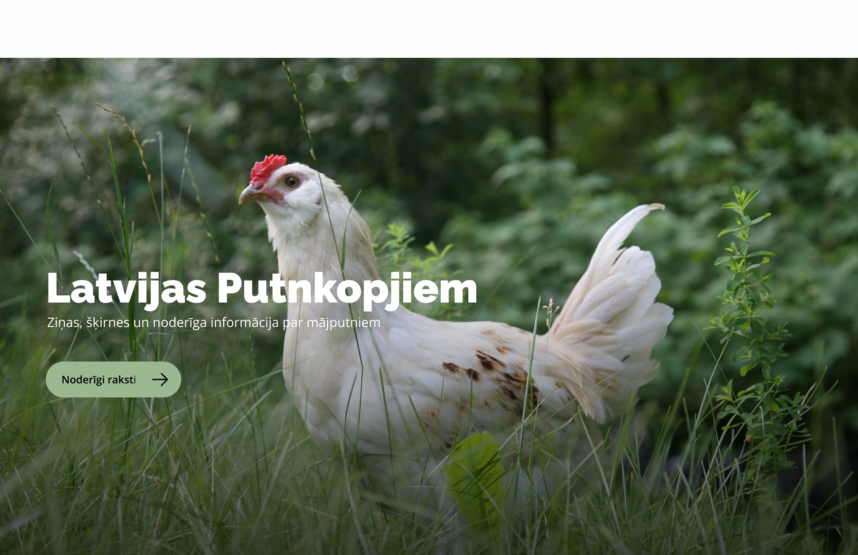
The website is the community's central hub, bringing together news, events, breed information, and membership resources in one place. The design builds directly on the information architecture established during wireframing, prioritising clear navigation and fast access to the content users visit most.
Filtri
With dozens of poultry breeds in the directory, the filter system was key to making the content manageable. Users can narrow breeds by purpose, behaviour, and characteristics through dropdown filters with clearly labelled options, keeping the selection process fast and intuitive, even for first-time visitors.
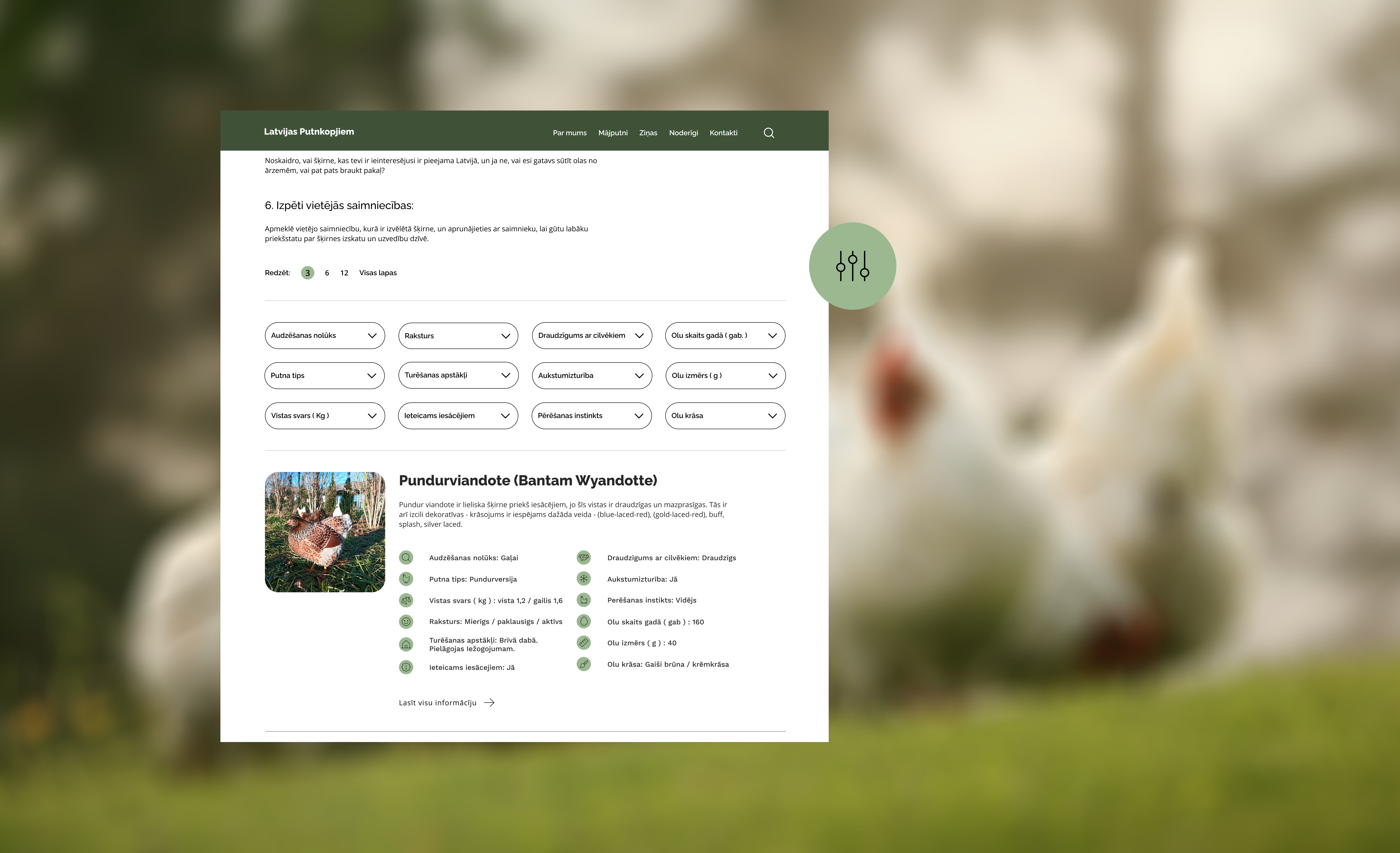
Breed Profile
Each breed has a dedicated profile page presenting key characteristics, temperament, and care requirements in a structured layout. The goal was to make comparison and discovery straightforward. A user exploring breeds for the first time should be able to scan and understand a profile just as easily as someone who already knows what they're looking for.
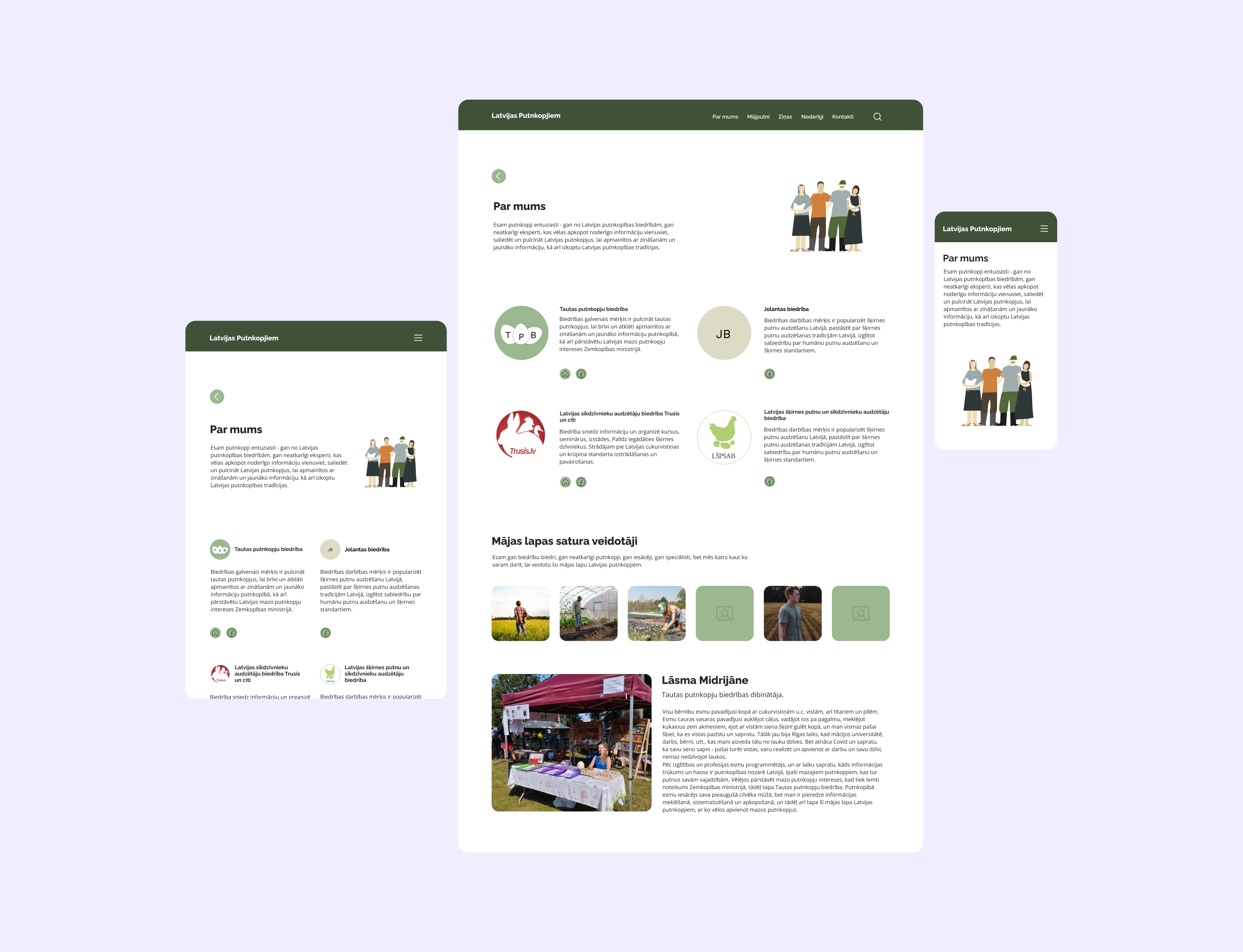
About
The about section gives new visitors context: the community's history, values, and purpose. This helps build trust before they explore the rest of the site.